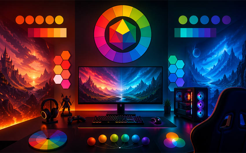
Colour Theory in Gaming
You rarely notice colour until something feels off. The warning red of a countdown, or the calm wash of a puzzle screen, all work on you before you process a single rule. Colour choices shape how you feel whilst playing games, whether that is on phones, browsers, or even formats like 75 ball bingo. When you understand how developers use colour, you start to see why certain games keep you playing, and others fade after a few minutes.
What Is Colour Theory in Gaming?
Colour theory in gaming describes how developers choose colours to support play. This affects whether a menu feels easy to read or if a level subtly pushes you forward without a flashing arrow. Developers often begin with a limited palette and assign meaning early, so your brain learns visual rules alongside mechanical ones. In casual titles, colour helps you scan information and stay oriented, which matters when sessions stay short, and attention competes with everyday distractions.
Colour Psychology: How Colours Affect Player Emotion
Colours trigger emotional responses because your brain links them to real-world experiences. Warm colours like reds and oranges raise tension because you associate them with urgency, while blues and greens slow your breathing and signal safety. Games use the psychology of colour to pace you. A horror title might drain colour from its world to heighten anxiety, then reintroduce warmth during moments of relief. In contrast, a cosy farming game leans on soft greens and pastels.
Guiding Player Attention Through Colour
Developers guide your behaviour through contrast rather than instruction. When an important object appears brighter than its surroundings, your eye snaps to it before you think. A common process involves muting background tones, then reserving saturated colour for interactive elements you can click on. You benefit because you spend less time searching and more time acting, which reduces frustration and keeps play flowing even when the game introduces new mechanics.
Colour in Casual Games and Bingo‑Style Experiences
Casual games rely on clarity and comfort, and colour carries much of that load. In bingo-style experiences, developers often use high-contrast numbers against neutral backgrounds so you can scan cards without strain. Soft accent colours separate different cards or game states, helping you track progress. In 75 ball bingo, this approach supports longer sessions because your eyes rest more easily, and you can focus on the rhythm of play rather than deciphering cluttered screens.
Accessibility and Colour‑Blind Friendly Design
Good colour design considers players who perceive colour differently. Many games now avoid relying on colour alone to communicate meaning. A practical approach involves testing palettes with colour-blind simulators and adjusting contrast levels so key information remains readable.
Immersion and World‑Building Through Colour Palettes
A consistent colour palette tells you what kind of place you inhabit before a character speaks. Developers often map palettes to narrative beats, shifting colour temperature as stories darken or resolve. You sense these changes subconsciously, which deepens immersion without adding extra dialogue or tutorials.
Why Colour Choices Matter for Modern UK Gamers
Colour choices directly impact the experience of a modern UK gamer. Thoughtful palettes reduce eye strain on smaller screens, speed up learning curves, and make games more inclusive. When you notice how colour shapes your reactions, you start choosing games that respect your time and attention.